
Valeria Getman and the Playkot team shared their insights on creating something new without losing a game’s visual identity, maintaining quality without slipping into overproduction, and designing characters that stand out in a market.
For an art team working on a long-running mobile RPG, the biggest challenge is not necessarily making something beautiful. The harder part is creating something new without losing the game’s visual identity, maintaining quality without slipping into overproduction, and designing characters that stand out in a market already filled with hundreds of vampires, elves, mages, and warriors.
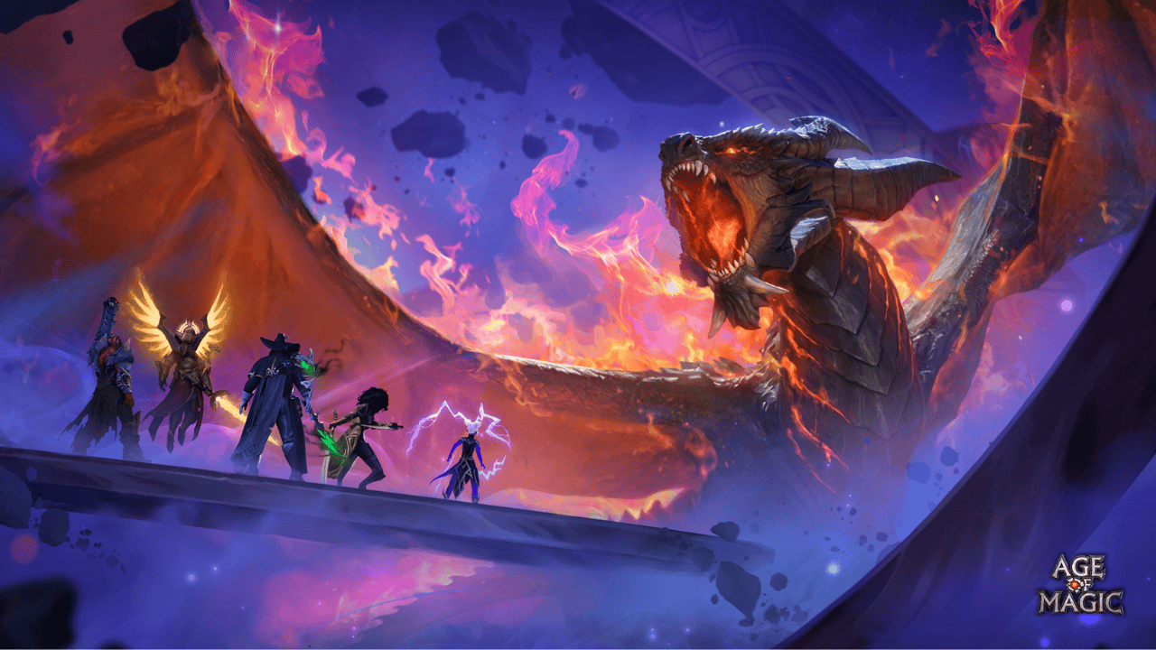
With every year a live-service game remains in operation, that challenge only becomes more difficult. For Valeria, Art Director at Age of Magic, one of the biggest challenges today is originality. The game already has more than a hundred heroes, and every new character needs to be distinctive enough for players to remember them and appealing enough for players to want to acquire them.
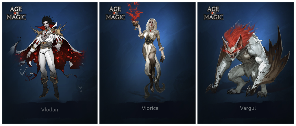
Even a familiar archetype needs its own personality. A vampire cannot simply look like a vampire – it has to look like a vampire from Age of Magic.
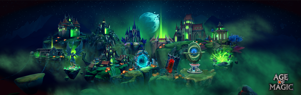
The same applies to events. You can’t simply repeat the same Halloween visual language every year. One year might be built around the Flying Dutchman, while another might feature a vampire ball.
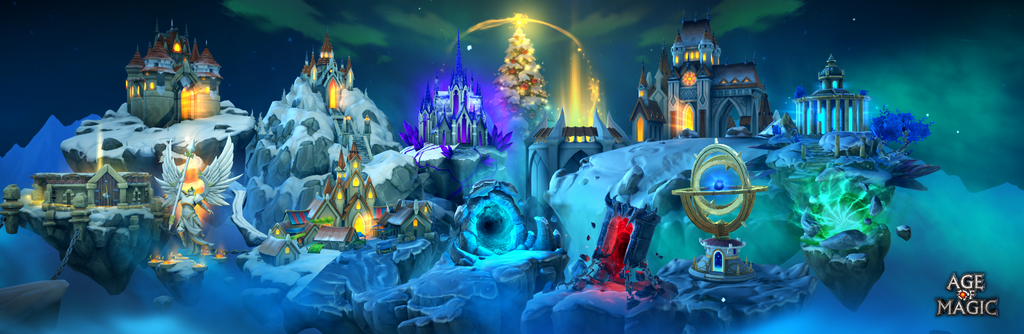
This leads to an important principle for anyone working on long-running games: the longer a product lives, the harder it becomes not to produce new content, but to find new ideas within an established visual system.
Start with a recognizable archetype – then break one rule
Age of Magic deliberately sits somewhere between colorful casual fantasy and heavy dark fantasy. Valeria describes the game’s style as a kind of “comfortable fantasy”: serious and epic, rooted in classic Western fantasy and Dungeons & Dragons, but without going as dark as Dark Souls or Bloodborne.
This balance matters primarily because of readability. A player should be able to look at a character and immediately understand whether they are an archer, priestess, mage, or warrior.
Valeria does not see these visual stereotypes as a bad thing. Used correctly, they become cognitive hooks.
The problem begins when the team stops there.
The artist first gives the player a familiar archetype, then looks for one or two details that will make the character memorable. Valeria uses Geralt as an example: most people probably could not recall every detail of his outfit, but his white hair and wolf medallion are instantly recognizable.
For a mobile RPG, this kind of visual hook is particularly important. The practical takeaway is simple: you do not need to make every detail of a character unique. You need to make the right detail unique.
A hero should communicate their gameplay before the player reads the description
Good character art is not just a beautiful visual. It is part of the interface.
The Age of Magic art team works closely with Game Design because a hero’s appearance needs to reinforce their role in combat. Weapons, scale, silhouette, clothing – all of these elements help explain what the character actually does. A mage carrying an enormous warhammer would create a contradiction unless that contradiction is part of the character’s core concept. Likewise, a small, elegant dagger might look great in concept art but disappear completely on a mobile screen during combat.
That is why the team deliberately exaggerates certain elements. Hands may be larger. Weapons may be oversized. Sometimes a dagger has to become almost as large as a sword simply so that players can see what the character is attacking with.
According to Valeria, a strong hero always emerges at the intersection of art and game design. In some cases, she considers the mechanics even more important: a beautiful character with uninteresting or unclear gameplay is unlikely to become a truly strong hero.
If a character deals AOE damage, their visual design should reinforce the sense of scale and power. If players need a long time to understand what role a character performs, the visual design has failed to do part of its job.
For mobile developers, there is a very simple test: if a character stops being readable when the concept art is reduced to its actual in-game size, the design is not finished yet.
A faction is a visual system, not just part of the lore
One of the main tools that helps Age of Magic evolve its visual language while maintaining consistency is its faction system.
Every character belongs to a group with its own visual rules. These might include specific colors, materials, motifs, proportions, accessories, or recurring shapes. This creates two levels of design: first, the team creates the faction. Then it creates an individual hero within that visual grammar.
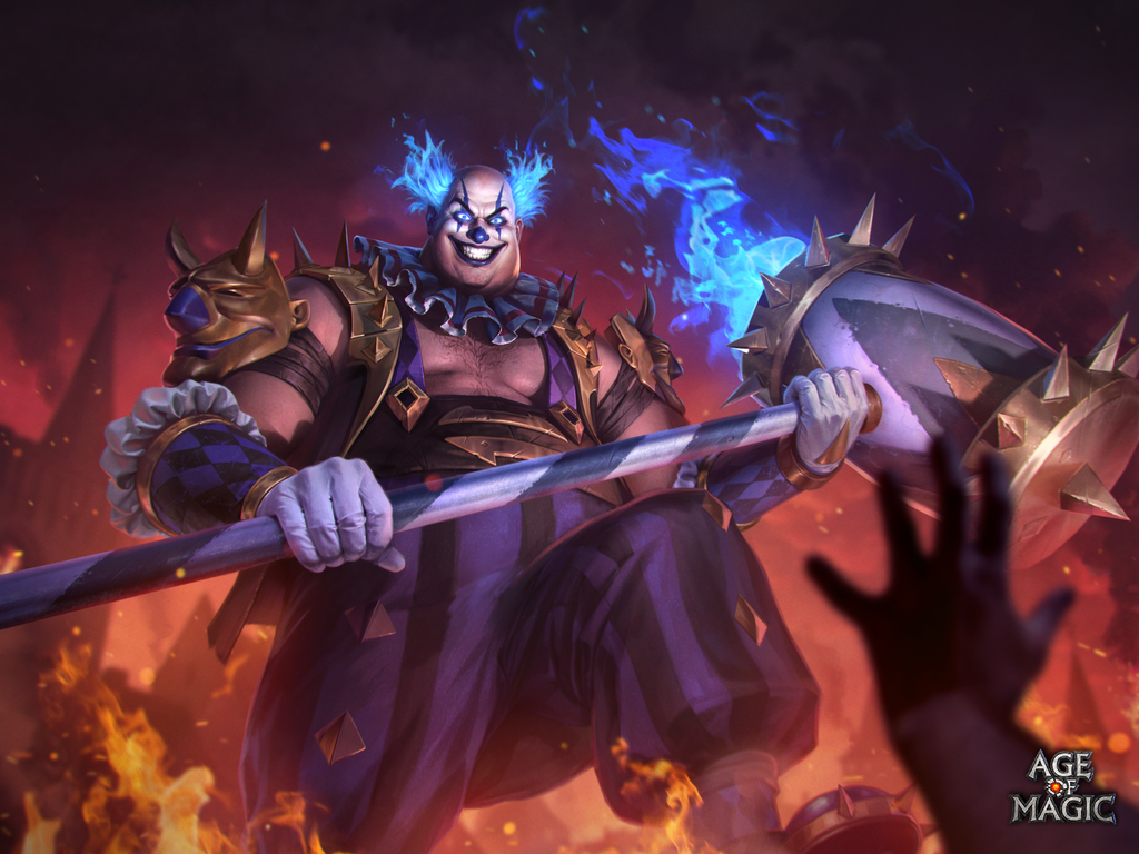
For example, a cursed circus faction might use diamond-shaped patterns, worn clothing, dark gold, and one additional accent color. Once those visual tags have been established, the question becomes much more specific: what makes this particular clown, performer, or fighter different from everyone else within the faction? A hero might have an enormous weapon or flaming hair, but the broader visual system keeps the character grounded within the same world.
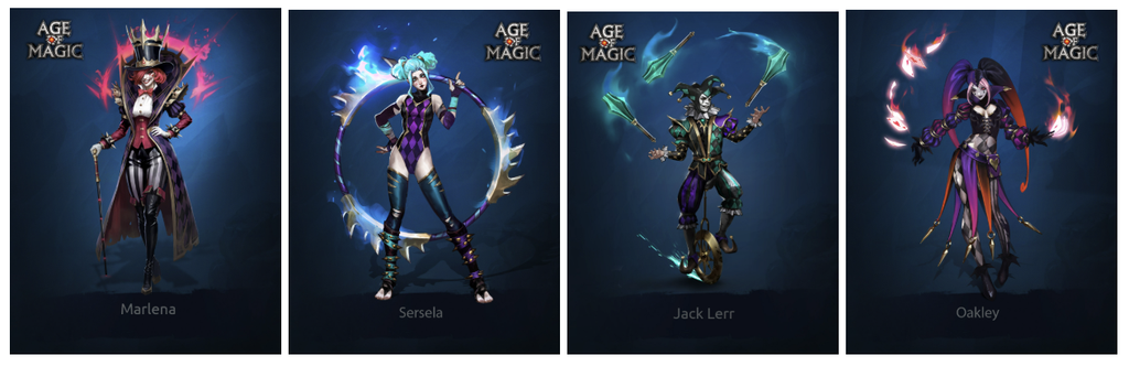
This approach has another advantage: it allows the team to experiment locally. A non-human faction can have very different proportions from an elven one. Players accept the difference because it makes sense within the faction itself.
For a mature game, this is a particularly useful way to evolve the art direction without breaking the visual identity of the entire product.
The first idea is almost never the best one
Fantasy has an obvious problem: mages, elves, vampires, and knights have already been designed thousands of times.
Valeria follows a principle she was taught at university: if your first idea immediately feels great, don’t rush to execute it. Chances are, you are not the only person who has thought of it.
That is why research is not simply about collecting references. Its purpose is to move beyond the first layer of obvious associations.
Collaborative brainstorming also plays an important role. A Concept Artist might start with a fairly conventional lightning-based character. Another artist might suggest running electricity directly across the character’s skin. Someone else might propose hair or tails shaped like lightning bolts. A Technical Artist can then turn those elements into animated effects.
The resulting character becomes the product of several disciplines rather than a single person’s imagination.
At the same time, feedback within the team is not chaotic. Everyone can contribute, but the final decision remains with the lead responsible for that area. Short daily syncs are used to discuss progress and blockers, while longer discussions are deliberately moved outside the stand-up so they do not consume the entire team’s time. Separate retrospectives are held monthly.
The goal is not to maximize the amount of feedback. It is to maximize useful feedback without undermining the artist’s ownership.
Stop polishing what the player will never see
One of the hardest things for a strong artist is knowing when to stop.
Valeria uses a very simple technique she calls “squinting.”
She looks at an image while squinting and evaluates which elements remain readable and which disappear. On a mobile screen, many beautifully rendered micro-details will simply never be visible.
If the shape, silhouette, and main focal points already work, additional polish may create no extra value for the player.
This matters because time is the most expensive resource in an art pipeline.
At Age of Magic, the team tries to avoid situations where an artist disappears for several days and then returns with a beautiful piece of work that does not actually fit the task. Production is divided into stages: a detailed brief, context, references, and early sketch reviews. The most open-ended and risky tasks are assigned to people who already understand the project’s visual system well.
This leads to a useful – if sometimes uncomfortable – conclusion for artists:
Quality does not mean maximum detail.
Sometimes the best artistic decision is knowing when to stop.
Standardize LiveOps as much as possible – and invest quality where players will notice it
LiveOps makes the tension between quality and production cost particularly visible.
At Age of Magic, a significant part of this production is standardized. Instead of creating six independent images for a single event, the team produces one strong key illustration that sells the theme and the feature, then adapts it for cards and other assets.
This saves time, but it also has an unexpected benefit: it improves readability for the player.
When different screens and offers share the same visual motif, it becomes easier to understand that they all belong to the same event.
Valeria describes these elements as “focal points” – places where the player should stop, notice the visual, and form a first impression of the feature. Everything else can be simplified.
This suggests another useful rule for live-service teams:
Spend your art budget where the player’s attention is, not where you simply have the most assets.
Mature art direction should be driven by hypotheses, not just taste
At Age of Magic, visual style is not treated as something defined once and then preserved unchanged forever.
The team tests visual hypotheses against audience response.
For example, some of the more experimental and unusual factions resonated less strongly with players visually than more familiar, human-like characters. That does not mean the experiment was a failure. On the contrary, it becomes a concrete constraint and a piece of knowledge that can inform the next design.
This is one reason newer elementals may use more human-like proportions: previous experiments helped the team understand how far the audience was willing to follow the artists.
The same approach applies to production value.
The team tries to understand what players actually notice: a hero’s theme, overall design, major VFX, readability. Some animation details may matter far less to the audience than they do to the artist.
As a result, art direction starts to resemble product development:
form a hypothesis → release it → observe the response → adjust the next step.
Three principles that help a visual style last for years
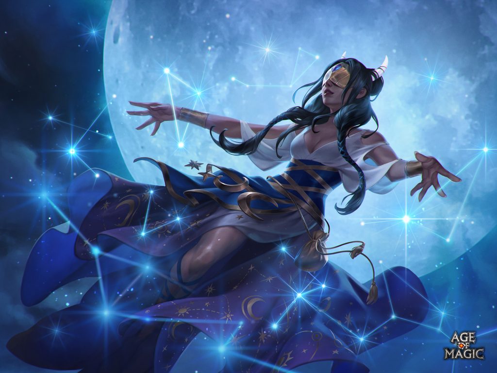
When Valeria is asked why Age of Magic’s visual style has remained recognizable over the years, she comes back to three things.
The first is archetypes. Start with a visual language the audience already understands.
The second is balance. Don’t push too far toward either colorful casual fantasy or dark fantasy if doing so risks alienating a significant part of the audience.
The third is cost versus value. The team needs clear benchmarks for detail, production time, and quality and an understanding of where additional effort genuinely improves the player experience.
Together, these principles point to a broader lesson for any team working on a long-running game.
Mature art production does not succeed by endlessly increasing the level of visual detail.
It succeeds by understanding what needs to remain familiar, what can change, where the player’s attention actually goes and when the right decision is to draw less, not more.