Remember how you’ve spent hours trying to snap the perfect profile photo for LinkedIn to ensure that it represents you accurately? Well, you can compare a LinkedIn profile photo to an app’s icon. It’s how people initially see and meet your app.
Illustrations and drawings have always been essential for communication, and app icons should reflect an app’s capabilities in an enticing and aesthetically pleasing manner. Finding the most suitable icon for an app needs time and work but has many long-term benefits.
Why do firms rebrand their icons – App icon rebrand examples
Imagine that you’ve found the perfect icon for your app, launched it, and had great success with it for a while. That’s it, right? No, not particularly. Apps rebrand their icons regularly to keep up with the changing trends as designers search for new ways to keep things attractive for the audience.
So, how can one create a perfect icon or update an old icon according to recent trends in 2022? Adjust knows how and kindly shares insights and best practices on the topic.
Google Play Store
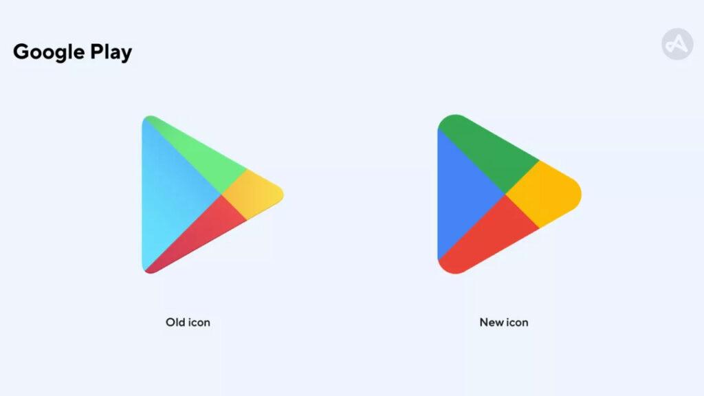
Adjust states that Google has made subtle changes to the app icon. The corners are rounder, and the icon’s colors do not shift tones; there are simply blue, green, red, and yellow. The company reports that this shift came from an attempt to unify the logos within Google, hence the resemblance of other logos like Google Chrome.
Yubo
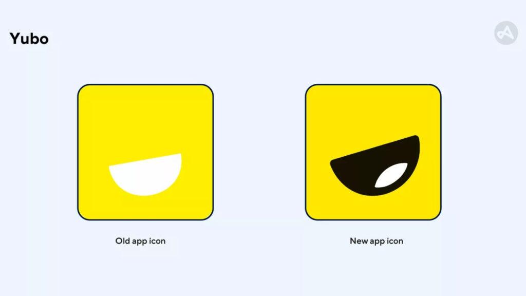
The live-stream video app changed its app icon’s appearance back in 2021. Adjust comments that a friendlier approach was made to ensure that the app’s younger audience would feel more familiar. The company also observes that the yellow tone is slightly darker, as the lighter yellow resembles the colors of Snapchat, Yubo’s competitor.
Remind
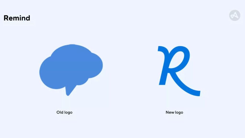
Remind is a school communication app that has utilized a logo that resembles both a cloud and a brain for the past decade. Adjust shares that the new “R” logo represents new application areas of the Remind app as it is now a communication platform for learning. The firm also points out that the old logo looked too much like a thought or message bubble, which is often used as an app icon.
Instagram has used many different icons for its app in the past 12 years. Adjust mentions that the logo resembling a Polaroid camera had trouble with trademarking, rendering it unusable. Instagram used its unique camera icon for the next six years, albeit making specific changes to it in 2011. The company notes that with an overhead lighting effect, along with a camera lens reflection, the icon seems inviting for users to take a quick selfie.
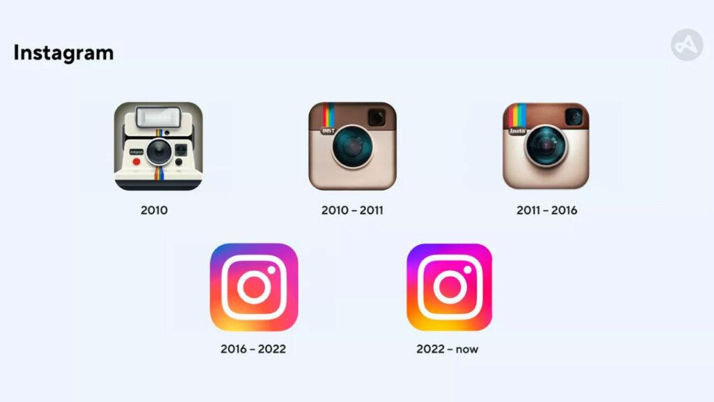
Adjust states that the changes made to the icon in 2016 were ahead of their time. With a brighter and flatter camera and colors like purple, pink, and yellow, Instagram managed to reflect the dynamic nature of the platform.
The 2022 version made the colors more fluid, along with making the whole icon brighter, as Adjust comments, “From a marketing perspective, making your app brighter than other apps on a user’s home screen is a strategic move. Now, users are more likely to notice the Instagram app compared to other apps.”
A/B testing and its steps
A/B testing is a user experience test done using two similar audience groups and dividing them into groups A and B. Two variants of the icon should then be tested by the groups in order to gain feedback. Adjust defines A/B testing as a very effective way to get data-driven insights and shares five steps for a successful testing period:
- Develop a hypothesis: What do you wish to achieve with the app icon?
- Create variants: Work with the design team to create variants that have one difference.
- Create audience groups: Prepare two groups with resembling behavior.
- Run the A/B test: Make sure the time frame is long enough to receive reliable data.
- Analysis: Analyze the results and keep iterating to test other elements.
Icons have been commonly used since the beginning of the 80s and have changed how people think entirely. Today, everyone knows that a “star” icon means favorites, and a “house” icon represents the main page or area. It is essential for an app icon to establish identifiability, allure, and creativity.
Adjust can help you with finding the right app icon, along with many other things that can help grow your app exponentially.
